These days, banks are constantly changing their online account design. The intent is good of course: they want users to have better experiences. However, sometimes new designs are worse. Yesterday (2017.06.12), AmEx changed its design again. I feel that the new design is mainly for mobile users. If you visit on your computer/laptop, the information density is very low. Besides, it’s not as easy to access all your cards if you have a lot.
Luckily, we saved a direct link to a very old design and it still works: here is the direct link.
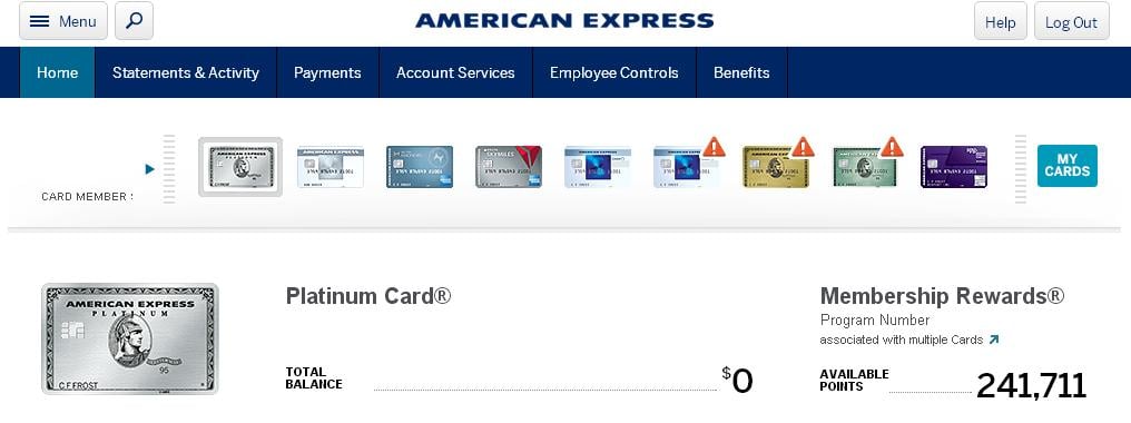
This is what it looks like:
The advantages of this old design are:
- Information density is high, you can see all your cards in one place, and it’s easy to find and change cards.
- You can see all Amex Offers directly, there’s no need to click “view all”.
- It’s really fast.
If you also like this old design, you can bookmark it to revisit it conveniently.